Why Municipal Websites Don’t Help Residents Get Things Done
Most municipal websites are built like filing cabinets. Very official ones, with search bars and PDFs. So many PDFs. They're organized around departments, bylaws, committees, forms, reports, notices, plans, agendas, minutes, and whatever page someone created in 2017 and has been afraid to delete ever since.
That structure makes sense if you work at the municipality. It makes less sense if you're a resident trying to answer a very normal question. Can I build a deck? When is my garbage picked up? How do I report a pothole? Do I need a permit? Where do I pay this bill? The information is usually there. Somewhere. The problem is that the website is organized around how the municipality works, not how residents think. Residents don't wake up wondering which department owns their question. They wake up wondering if they can build the deck before their brother-in-law visits and starts offering "helpful" advice.
The Website Is Not the Goal
A municipal website is not just a website. It's a service counter, call centre, notice board, form library, payment desk, meeting room, and customer service channel. But many municipal websites are still treated like communications projects — new design, new homepage, better photos, fewer buttons if everyone is feeling brave. Those things matter. But if residents still can't complete the task they came to do, the website hasn't worked.
Most residents don't care which department owns the answer. They want to pay, apply, report, book, register, find, understand, or complain with moderate dignity. What they don't want is to understand the organizational chart before they can access a service. Is this Public Works? Planning? Building? Finance? Parks? Clerks? Operations? Other? "Other" is doing a lot of heavy lifting.
A better website starts with the resident's task:
Pay a bill
Report a problem
Apply for a permit
Find a collection schedule
Understand what's happening in the neighbourhood
That sounds simple because it is. It's also hard to do if no one has agreed who owns the content, who maintains it, and what the resident journey should actually look like.
Search Is Not a Strategy
A lot of municipal websites rely on search to save the day. That's optimistic. Search helps when residents know what words to use, but residents often don't use municipal language. They search "garbage," not "solid waste." They search "building a deck," not "residential accessory structure." They search "tax bill," not "interim property tax instalment." If the website depends on residents knowing internal terminology, it's not resident-friendly. It's just searchable bureaucracy. Good municipal websites use plain language and make the obvious things obvious.
The Homepage Can't Save You
Municipal homepages get a lot of attention. Everyone has opinions. Someone always wants a button. But most website success doesn't happen on the homepage — residents often arrive through Google, email links, social media, or bookmarks and land directly on service pages. That means the building permit page has to work. The waste collection page has to work. The tax page has to work. A resident should be able to land anywhere on the site and immediately understand:
What they need to do
What it costs
How long it may take
Who to contact
What happens next
If the answer is hidden in three PDFs and a paragraph written for people who already understand the process, residents are stuck. And stuck residents call.
What Better Looks Like
A good municipal website doesn't just look nicer. It reduces work. Clear service pages mean fewer calls. Plain language means fewer confused residents. Better forms mean fewer incomplete applications. Current information means fewer staff answering the same question 40 times.
A better website starts with the services residents use most. Look at call volumes, search terms, website analytics, front counter questions, and staff pain points. Those repeat questions aren't annoyances. They're instructions, telling you exactly what the website needs to do better. Start there. Fix one journey at a time — make the page clearer, remove duplicate content, put the form where people can find it, explain the process, say what happens next. This doesn't always require new technology. Sometimes it just requires decisions.
The Shift
A municipal website shouldn't make residents learn how the organization works before they can get something done. It should meet them where they are, help them complete the task, and get out of the way. Once municipalities start thinking that way, the question changes. It's no longer "Does the website look good?" It becomes "Can residents actually use it?"
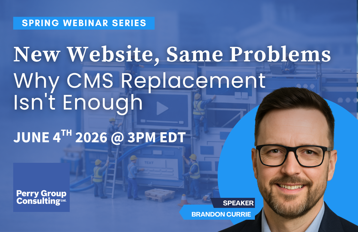
If this resonates, join us on June 4 for our free webinar: New Website, Same Problems: Why CMS Replacement Isn't Enough.
We'll walk through what we found in Perry Group's 2026 Municipal Website Inventory, what the governance gap actually looks like in practice, and how we help municipalities move from assessment through to platform strategy, operations, and procurement